On this page you'll find readings about the painting technuique. Other articles around art and painting is collected in my book "Sigmund Berglund - Preludium". 232 pages with paintings, closeup photo's, info and articles. Unfortunaley, this book is not avalable in english. Norwegian only.
Paint 2.0
To paint naturalistic is all about reproducing reality. Let the eye define the world as the hand transmits the impression to the canvas. This seems like the only way to perfection. But the human experience includes multiple senses, and this is why the photo from the mountain trip cannot tell the magnificence of the majestic peaks. The eye spotted mainly the same view as the camera, but the moment held so much more - smells, sounds, temperature, mental state, stories ... This is where Paint 2.0 starts. What used to be about reproducing the visual input, is now about approaching the whole experience through painting.
And how do we do this? I'm not entirely sure... and there aren't too many wisemen to ask either.
For me, a well-made painting includes 3 important parts: idea, composition and technic. While the idea is about what I paint, the composition is about how I organize the canvas. It is logical to think that painting a child means exactly that - painting a child. But Paint 2.0 is about creating an experience of the child.
Berlin
Like a paradox, the expression in the image may increase when I paint less. By using a representation of the child instead of the child itself, we are all forced to interpret the child based on our own history and experience. This way, spectators will easier get an ownership to the painting, in opposit to when the artist conveys his very peronal story. This reflects my view on image titles. I leave them open for interpretation rather than describing my idea.
However, Paint 2.0 is first and foremost about the technical part. How I use painting techniques to go beyond realism. In this process I have focused on 2 simple things. - Which may not be darn simple to implement.
1. I want to paint the energy of the object instead of the object itself. - To paint the grip instead of hands. To paint the walk instead of the feet. It has been fruitful to turn my thinking around this subject. Now, I won't focus on painting the person, but on communicate what the person stands for. Realism is no longer the most important thing. Instead I want to give a touchy experience. While I can't surpass the photo in reproduction of the realistic, I can use painterly tools to give an expression that transcends realism. The tools themselves are not new, but I have changed the focus for their use.
Here, we meet the imperfectness. If I painted the perfect human, there were no personal interpretation and recognition. Where advertising designers retouches photographies to dull perfectness, I want to paint the imperfect and unique person. This is what I define as 'painterly beauty'.
2. When I paint a scene, much work is about lighting. As a painting newbie, this was about giving the object a shape by the use of light and shadow. Eventually I became aware of the angle of light, the drop shadows and the highlights, which significantly increased the rendering quality. The process then evolved to paint reflections, mirror effects and spot lighting. In Paint 2.0, the next step is the use of light that is beyond the natural light. It can be angled reflections or a dynamic light with different intensity throughout the beam. This gives a different experience than natural light, and I allow myself to play with reality. When I add something that doesn't exist and our eyes still believe in what we see, a touch of magic may arise.
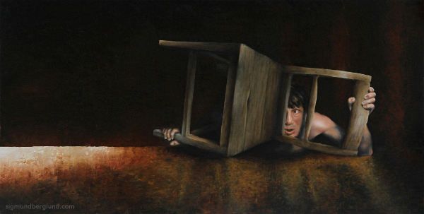
The chair
Sigmund Berglund
2020
Paint by number
I'm going to tell you how I paint photo realistic. It's neither hard or any kind of magic - I just stick to the plan. Without any art-classes, I will probably not tell you the recommended way of doing things, but it works. At least for me.
I guess you have seen the paint-by-number kits in the hobby-store. The surface is filled with drawn fields with a number in each one. The numbers correspond to a color, and our task is to cover every field with paint from the correct tube. This doesn't require any refined skills, and it is exactly how I do most of my paintings. The minor difference is that I build up a unique paint-by-number sketch, from scratch, every time.
But as you know, paint-by-number doesn't give a photo-realistic look. The trick is to blend the different fields together. In nature, light and shadow give a variety of values and colors, and each of these has its own paint-by-number field. Defining how hard the blending should be, gives the form of the object. A long gradient makes the form look smooth - a shorter gradient gives an edgy look.
The daughters of the pharmacist, 2018
This method gives a good-looking image in one paint operation. - Opposite to those who works with many thin layers. Be aware that such a one-layer approach has a weakness. You will experience that it's hard to obtain the brightest white and the darkest black. This because of the blendings, and because it's impossible to keep the brush clean during the session. I end up with a second layer using black and white to enhance these values.
At this point I have painted with my current skills. Now it's time to expand... I use time to improve the painting even further. Every choice and stroke I make in layer 3, 4 and 5, evolves my eyes. This new level is put into my next paint-by-number session. I become better every time...
Sigmund Berglund
2018
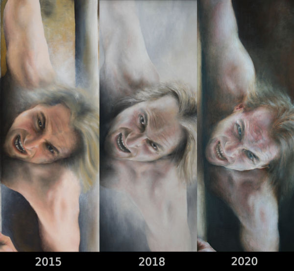
5 years
In my mind a good image consists of 3 parts - a good idea, a good composition and good craftsmanship. My goal is to develope all 3 parts, but in this particular project the idea is reused. It's only the composition and the craftsmanship that have been refined. The older painting is only 5 years old, but it still felt right to add something new to the idea. I like these comparisons, and have done similar projects several times. They make it easier to recognize my own development. It's hard to notice from week to week that our painting skills evolve, but seeing these two paintings side by side clearly tells us that something has happened.
Airborne 2015 / 2020
Becoming a good painter takes time, and my painting skills have improved the last 5 years. Not every improvement is easy to point at, but some parts is easy to detect.
Outperform the raw-material
Painting after photo has a weakness in that information may disappear outside the focal point, and in completely dark and light areas. Also, it can be interesting to improve both perspective and lighting to show desired details. This requires to paint more than the reality shows, and I was not trained to do so in 2015. I am in the very beginning of using this advantage, but there has become a confidence in my work that allows the result to outperform the raw-material. The 2020 version has more active paint in the light and in the dark, and details have been both added and removed. These new skills allow more focus on the expression of the painted object rather than similarities to the photo or reality. More about this important topic in the article "Paint 2.0"
focal point
There are many paint-tools that create focal points. Color temperature, line sharpness and level of detail are all examples of tools to emphasize the endpoint of the observation. Being able to understand and utilize these tools has taken time, and the 2020 painting is created to be an easier image to look at. Eg. the sharp lines are reserved only for objects in the nearest foreground, and the color temperature doesn't counteract on the illusion of depth - like in the 2015-painting.
Overpainting
It's basically the same 5 tubes in use today as it was 5 years ago. It's how they're used that have changed. In 2015 we see an excessive use of colors. Especially in the skin, which appears almost orange. It's normal to exaggerate what we recently have learned, whether it's the discovery of wrinkles or skin tones. I call it overpainting, and is an everlasting issue as long as we learn. The goal is to master every minor aspect so that overpainting gets minimized.
In addition to the paintings from 2015 and 2020, I did some studies from the same raw-material in 2018. This gives a great opportunity to see overpainting of skin colors in 2015 and wrinkles in 2018. What is overpainted in the 2020 version will hopefully become clearer next year.
The painting technique is interesting, but it's the compositional tools that mainly create the new expression in the 2020 painting. In 2015, my focus was to create movement within the composition. The idea was to add compositonal disturbance, so that the eye never got rest. An always moving observation is meant to give a feeling of energy. An unresting composition works, but in the absence of other tools, there may have been an overuse of compositional disorder. By 2020, this has changed. There is still a desire to create a movement energy in the painting, but at the same time it should be pleasant to look at. To a greater extent, the eye will have an easy way into the picture. From the first meeting of the man in the foreground to the light in the sky and the man in the background. As the composition-lines lead towards the light, the eye is guided this way. This is reinforced by the space created by the perspective and by painting techniques discussed above.
The choice of colors are warmer in 2020, and the values aren't as intense. Pure black and white has only been used to a small extent, while the midrange has been enhanced. This gives the painting a calmer tint, where a warm brown has replaced a cold gray. But painting brown often becomes boring uniform - because we use the pure paint from the tubes instead of mixing browns. Painting a rich brown landscape requires mixing browns in countless shades. If you study the colors of the older painting, you may recognize both the pure ocher and the distinctive blue-gray color created by titanium white and ivory black. In the new painting the mix of colors has been better done, and with a richer color range we get closer to naturalism.
How each of the paintings is experienced will of course be individual, and it may well be that some people like the old painting better. What is important to me is how I master new tools and the choices I have made to create a new variant of an old idea. My paint toolbox gets refill, and this creates new opportunities. In the hunt for painterly development, I push my eyes and brain to see and think better.
Sigmund Berglund
2020
Tubes and brushes
This article is boring. Well, maybe not if you paint yourself. I will go through what colors and brushes I use. I don't have any secret recipe, and I share gladly everything I know. That is how the world evolves...
My color palette today is poor, - only 5 tubes in the basic range. A limited palette is practical, but more important, it's the easier way to color harmony in my paintings.
Raw umber
Unlike burned soils that are usually reddish, raw umber is a dead brown. This makes it easy to tone in the desired color direction. Since brown is an easy color to mix, this color is not stricktly required. But I paint a lot of brown, and it's convinient to use this cheap pigment as a base.
Yellow ochre
Over the years, I've used different yellows, but have lately returned to my starting point - Yellow ochre. It's warm, and harmonize well with the red one.
Light oxide red (english red)
A deep and strong red tone. Use with caution, but irreplaceable when I paint blood in the skin. Mixed with yellow ochre, I get a warm reddish ochre for a basis in warmer paintings.
Titan white
This is a powerful color - total opaque. Therefore, I mix some Titan white in nearly all other colors to give them better coverage. This white is cold, and many would maybe prefer eg. zink-white. But remember, I don't choose a finished color - I choose the one with the widest spectre of usage. A cold white with yellow ochre becomes warm.
Ivory Black
This has a bluish tone, and is perfect for shading areas in the skin. It says "black" on the tube, but it also works as my blue. Mixed with Titan white it's easy to see the blue. Mixed with red and yellow I get beautiful violet and green. I avoid using Ivory black alone in black areas, as it becomes too monotonous and boring. Together with umber and red the blackness awakens.
The paintings below contain only these 5 colors.
Excerption from "Thursday"
These 5 colors give a classic and calm palette. I find it beautiful, even though limited when it comes to strong yellows, blues and greens. When needed, I use a guest color to increase the saturation. This way I also become familiar how the colors put different moods and how they interfere with the pigments in the base palette. For the moment, I have settled with 2 extra tubes to extend the basic palette.
Cadmium lemon yellow
A cold and strong yellow that extend the spectre of yellows - and of course greens. Perfect in my studies of skin-tones. It's surprising how much green I use when painting skin.
Ultramarine
It sure took some time to find the beauty in blue. Maybe it was the undestanding of how small amout of blue needed to make the world bluish...
The beginning
Oil paint has some advantages and some disadvantages compared to other types of paint. Some disadvantages are odors and solvents. The main advantage for me is the long drying time and that the color does not change when it dries. Water painting changes the tint, and it's therefore harder to continue working on a dry image. I paint big, and with oil paint I can paint the body over several days and weeks.
Finding the same skin-color that I used last week is not difficult because:
I have few tubes to choose from.
I have time to mix the colors on the canvas until it becomes identical to the existing.
I know that the color does not change when it dries.
My brush
I work with only one type of brush - 10mm flat peak. It's made of marten hair. That's all. Ok, there are some exceptions, and I will discuss them below. Many are surprised by this lack of tools, so I quicky admit that I use 3 equal brushes at the same time. One for light colors, one for darkness, and the last one for everything else. With strict discipline, I keep the brushes 'clean', avoiding all three to become dirty and brown. This is the way it should work. - In real life engagement they all get a bit dirty, but the idea is clever and works 'sort of'... After the painting have dried, I use the second layer to sharpen up the lightest and darkest areas.
I paint naturalistic, and it probably would be logical to use smaller brushes in addition. 10mm is rather big when it comes to details. But the flat peak is sharp and pointed when angled. At least when the brush is new. Marten hair wear down quickly, so expect to use one brush per painting. A syntetic brush is much more durable, and I have tried to find a syntetic with equivalent elasticity - so far without luck. Marten hair is stiff when using the entire brush, but also rather soft when leaving the canvas. No distinct craters where the brush is lifted.
I paint naturalistic, and such a big brush has an unexpected advantage - it keeps me away from details. I want my paintings to be 'true to nature' - but not photographic. I want everyone to see that my works are painted. I have pedantic tendencies, and could easily focus on details with ultra-thin brushes. With the 10mm brush, I have placed an obstacle for my personality. I paint to convey - not to compete with the camera.
Now let's talk about the exceptions.
Blender brush
I use a brush made of badger hair for the softest gradients. This one don't leave any traces after brush-hairs. To expose the paint direction is often meaningful, but sometimes not. Clouds is an example of what may come better to life using a blender brush. The downside with this brush is the need of cleaning after usage. My other brushes are simply sealed between each paint-session to avoid contact with air. The blender brush have to be absolutely clean of 2 reasons: It shouldn't affect existing colors, and because the hair get heavy and stiff of old paint which leave marks as the other brushes.
Palette knife
The knife is great to create unpredictability. I paint with a great deal of control, but the painting knife forces coincidences. I use this to achieve simplification. Painting a stone doesn't require the same details as a portrait. The palette knife helps to create interesting surfaces without too much active painting.
Gauze cloths (bandage)
Gauze cloths doesn't give off fluff like other textiles do, and is well suited as a painting tool. Personally, I use gauze cloths for 2 things: Thin glazes, and to remove gloss of fields that shine by rubbing with the gauze. The amount of oil and drying time vary between the colors, and therefore different gloss/shine may occur on the surface. It's hard to get the overall impression of the painting when this occurs, and even if the painting were to be varnished afterwards, the painting process will be easier with an even matteness over the entire canvas.
Finger
Perhaps the most important of all painting tools. It moves paint, picks up paint, creates sfumato, melts colors together, glazes....
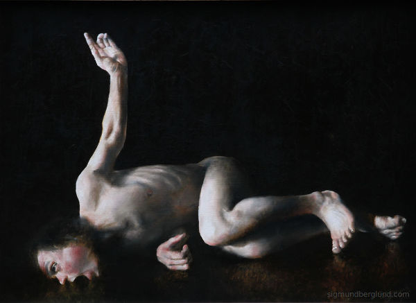
Good Friday
In the painting "Good Friday" it's easy to see how different painting tools can create different surfaces. The stone is painted with a palette knife - the rest with the marten brush.